TAKE PHOTOS OF INTERVIEWING


<
>
1
2
3
4
CLASS 7 - HOMEWORK
SKETCHES/WIREFRAMES
TAKE YOUR PROBLEM STATEMENTS AND CONCEPTS. COME UP WITH MORE DETAILED SKETCHES OF WAYS TO EXPLORE ONE CONCEPT.
TAKE PHOTOS OF THESE FOR YOUR CASE STUDY
REALLY IMPORTANT!!!!!!!!!!!!!!!!!!
USE ONLY BLACK, GRAYS, WHITES AND
ONE PRIMARY ACTION COLOR. DON'T USE
LOTS OF COLOR YET.
CREATE A LOW FIDELITY CLICK-ABLE PROTOTYPE OF 1 WORK-FLOW OR SCENARIO.
IF YOUR APPLICATION SOLVES MULTIPLE
PROBLEMS AND HAS MULTIPLE WORK-FLOWS,
THEN SET UP THE NAVIGATION FOR THOSE BUT ONLY DIVE DEEP INTO ONE WORK-FLOW.
-
USE ILLUSTRATOR/SKETCH FOR USER INTERFACE WORK AND INVISION FOR PROTOTYPING OR ADOBE XD FOR U.I.
WORK AND PROTOTYPING
REALLY IMPORTANT!!!!!!!!!!!!!!!!!!
PUT PICTURES OF THE CONCEPTS IN A FOLDER CALLED "CONCEPTS" WITHIN YOUR GOOGLE DRIVE FOLDER
5
6
PUT YOUR WIRE-FRAME DESIGN FILES AND PROTOTYPE LINKS (LINKS GO IN A GOOGLE
DOC WITHIN THIS FOLDER) IN A FOLDER
CALLED "WIRE-FRAMES" WITHIN YOUR
GOOGLE DRIVE FOLDER
BRING THIS INTO NEXT WEEKS CLASS AND
WE'RE GOING TO STEP BACK AND MODEL IT :)
WIRE-FRAME
WHY
Wire-frames are not half-ass design, they’re well thought out designs that look unpolished. Users are more willing to give honest feedback to something that looks “unfinished" and it's important to not spend time polishing something if you're not certain. Avoid the " i spent a bunch of time making that look good and we ended up not needed it."
GOOD
NOT
THE WIRE FRAME
HAVE JUST THE RIGHT AMOUNT FIDELITY
LOOKS LIKE A FINAL PRODUCT
DOES NOT HAVE FAKE COPY (lorem ipsum)
USES FAKE COPY
USES REAL PHOTOS AND QUICK ICONS WHEN NEEDED
JUST USES GRAY SQUARES TO INDICATE PHOTOS
HIGHLIGHTS THE CONTENT
LOOKS SLOPPY AND NOT "STRUCTURED"
VALIDATES THE WORK-FLOW AND INTERACTION MODEL
EVERYTHING IS A 1-OFF AND NO RE-USE OF MODEL MATERIAL
HAS GOOD PLACEMENT FOR USER LOCATION (pagination)
THE USER HAS NO IDEA OF "LOCATION"
USES GOOD DESIGN PATTERNS AND DEVICE PARADIGMS
INTERACTION DETAILS ARE NOT MAPPED WITH LOGIC (CHECK BOX)
GETS INTO THE DETAILS AND VALIDATED MICRO INTERACTIONS
DOES JUST HI-LEVEL AND DOESN'T ACCOUNT FOR DETAILS (ERROR)
GOOD
EXAMPLE
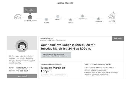
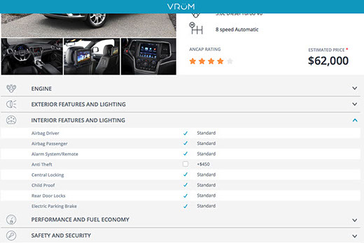
Has clear work-flow location, content and highlights content
EXAMPLE
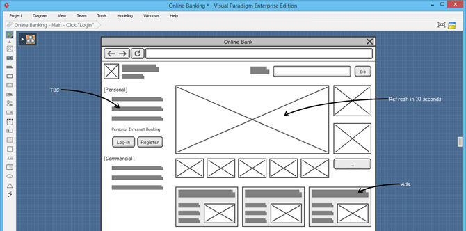
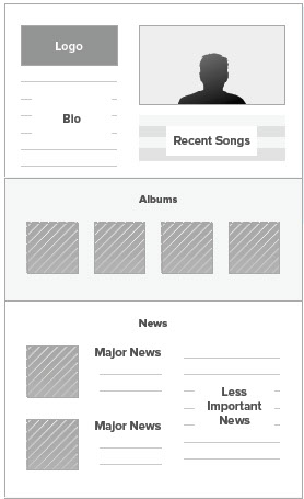
NOT
EXAMPLE
Don't know what the boxes are. The square bars are confusing..
EXAMPLE
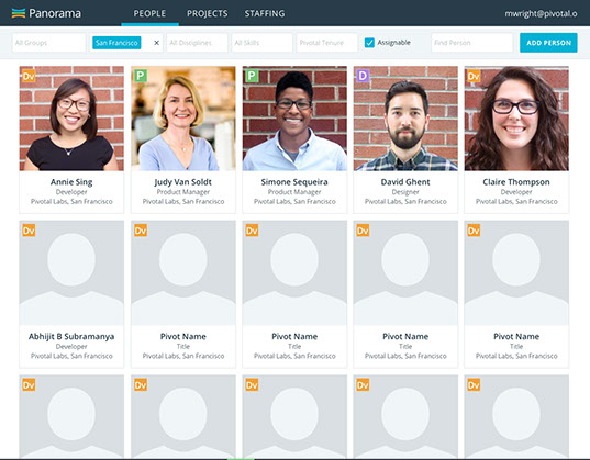
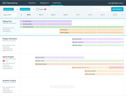
GOOD
Does good at mixing the repetitive while giving photo context.
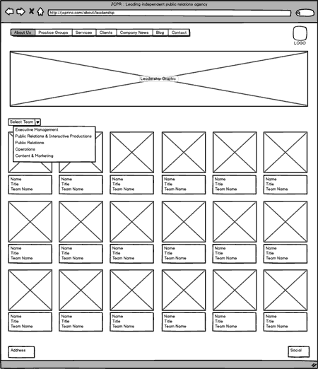
NOT
Context is unclear and repetition isn't distinct enough
Getting into the details and micro interactions
Not showing enough details
Good use of alignment, grid and negative space
No a good use of negative space and symmetry

HOME WORK WIRE-FRAME EXAMPLE
00:00
00:00
GOOD
GOOD
NOT
NOT
EXAMPLE
EXAMPLE
EXAMPLE
